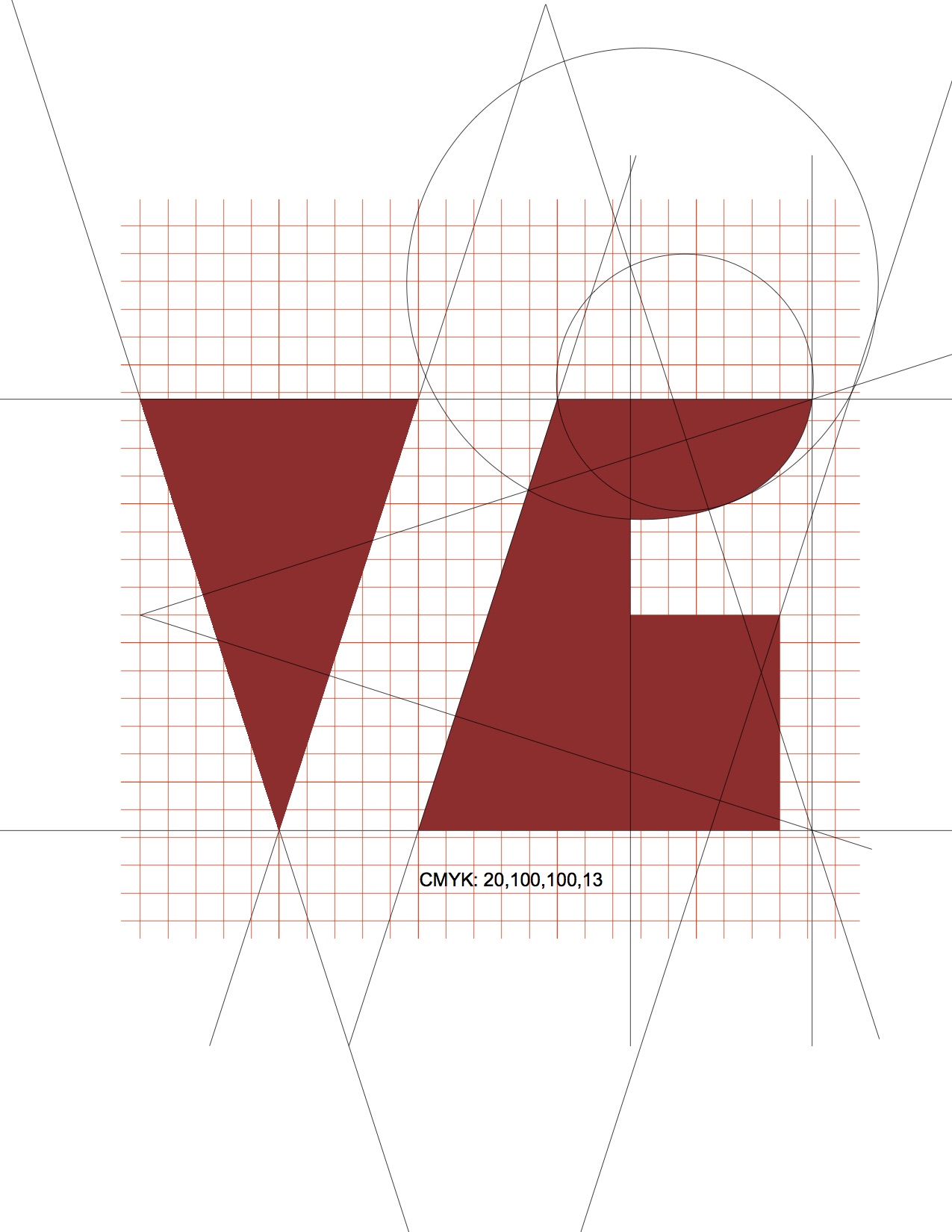
VolumeOne Logo
The challenge was to create a graphic design that reflects the architecture of the firm.
The logo reflects a volume composed of multiple entities, like a team of individual collaborators. Like the philosophy of the firm, the logo should reflect a maximum of expression with one form-giving strategy and with the least number of components. In the ideal scenario, no additional components must be added to find the balance of function, expression, and communication
A rectangle stands for the basic architectural and neutral form without any particular expression or opinion; the subtraction of the letter ‘V’ and the number ‘1’ gives a more expressive and distinct form and expression to the original entity. The subtractive move creates two inherently related forms of recognizable, yet abstract and distinct characteristic.
We chose No. 32090 for it’s complex reflection of strength, depth and attention - an homage to Le Corbusier’s 1931 collection of colors.
The functional, understated, and ubiquitous Helvetica stands for a modern and timeless character which stands out from thousands of typefaces.


