Visual Communication
Building wayfinding and warning signs
Despite the abundance of available signage for buildings, and especially multi-family buildings, no available graphic met our understanding of clear and minimalistic, yet easy to understand visual communication. Often, signage remains an afterthought in the planning and design of buildings, but is in all cases a necessary and code regulated, requirement. We believe that each building requires special attention to detail, and this includes the coherent and precise design of the visual communication devices. Just like the selection of finishes or hardware for a building, signage becomes one of the primary visually detected impression of a building. Certainly, signage for wayfinding or warning signs are important and are designed for visual communication. The message needs to be universally understood, quickly recognized, and clearly interpreted. Sometimes, and especially for warning signs, the use of color is advantageous or even necessary.
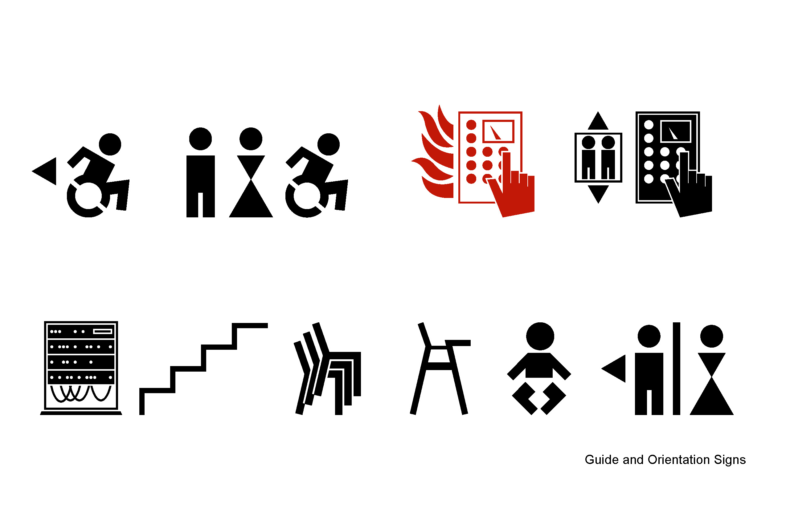
Pictograms became an art form, which had its breakthrough with the special techniques developed by Otl Aicher for the 1972 Olympics in Munich. Aicher’s method of the creation of a common language through repetition enhanced the graphically reduced and abstracted set of pictograms.
In this tradition, we developed a contemporary interpretation of Aicher’s and other universally understood pictograms. We deployed a new form of abstraction using simple, angular visual language to better reflect the architectural language of our buildings. The idea is to create a wholistic language, maybe even a ‘Gesamtkunstwerk’ in the modern sense, where all attributes of a building are consciously balanced with one another and where we minimize default or accidental applications.
We also believe that during the recent history, where society already underwent a certain learning curve to understand the content of pictograms, we can assume that the clear communication with language-independent pictograms can be universally understood and do not require the additional use of the written word. In a multi-lingual world, or in situations of illiteracy, the sole use of the written language for wayfinding and warning is clearly a disadvantage. Yet commercially and code required signage often uses both visual methods of communication, abstract pictograms and written language, and two tactical methods of braille and regular raised letters of the written word.
Our design approach focuses on the reduction of information overload and distractions in a building and rather focus on the concentration on clear communication for safety and wayfinding.
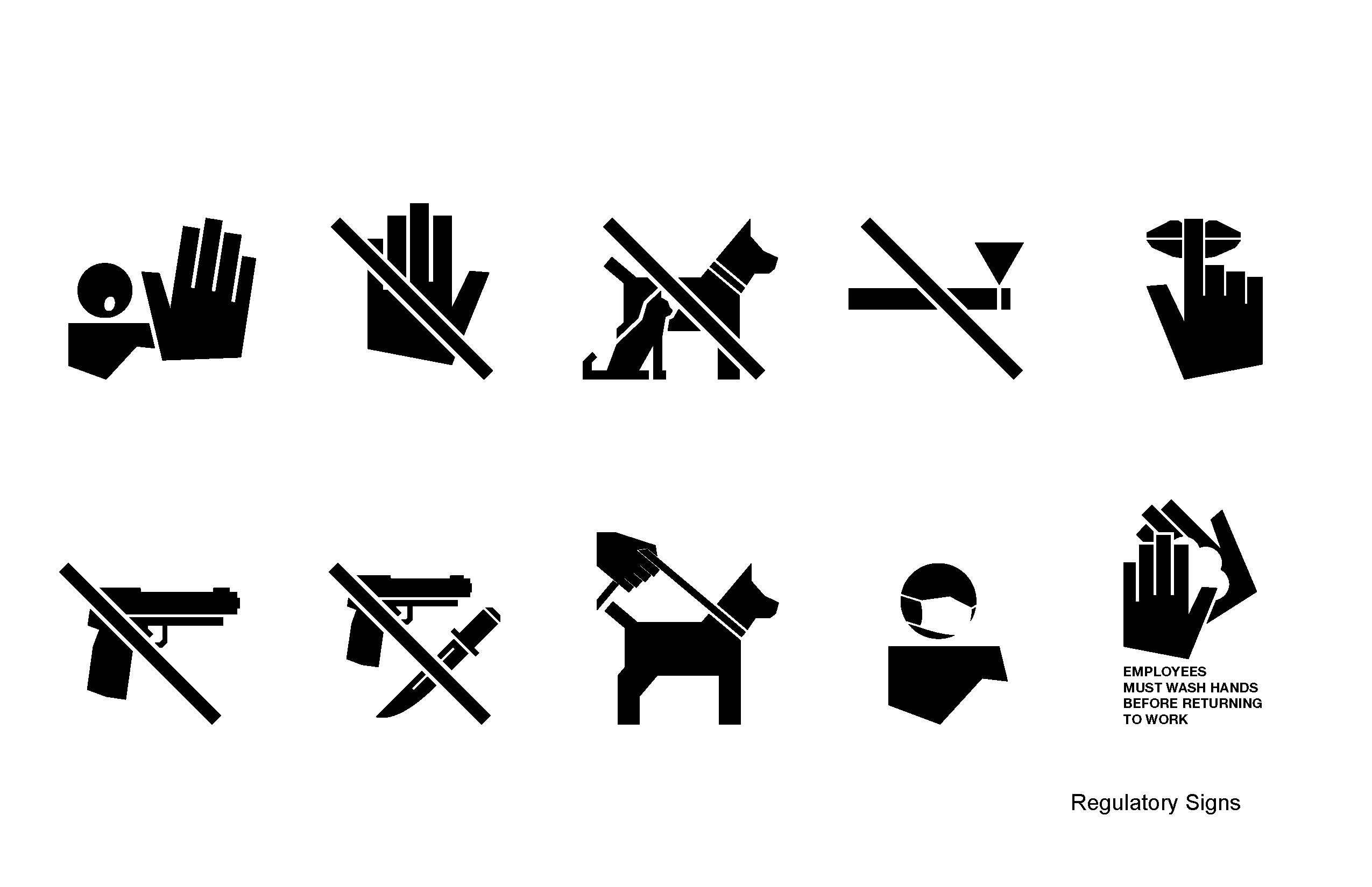
For example, since about the 60’s, there is a clear universal understanding of ‘no smoking’ or restroom signs. Any written explanation would be superfluous or at least would not add to the communicational value of the pictogram or the entire sign. In most cultures, the green pictogram of person running through a door is understood as ‘exit’, consequently no need for additional explanation. We continued this logic with all pictograms.
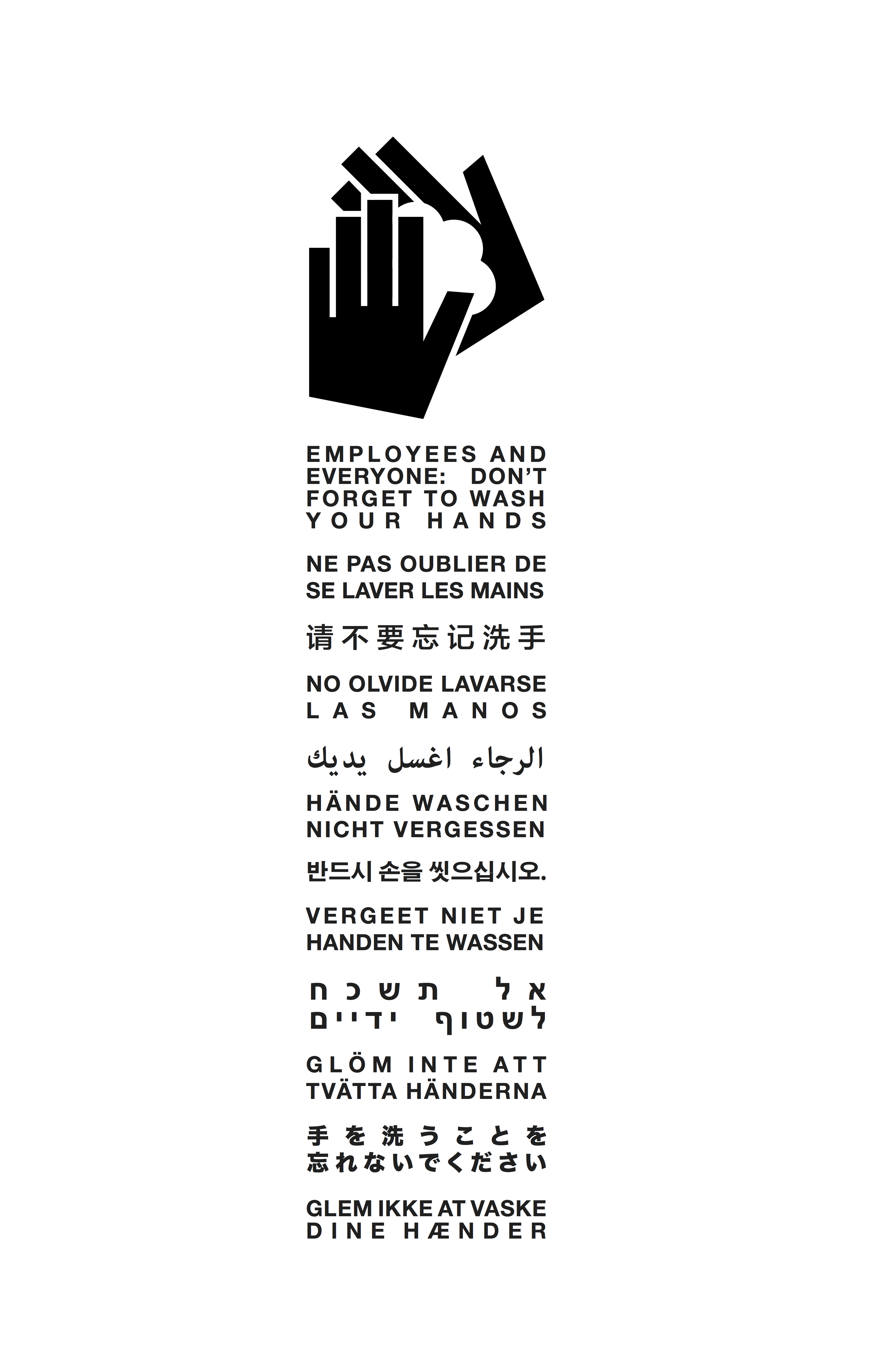
However, code in the United States requires a sign in workplaces that instructs employees to wash hands when to return to work from a rest room visit. We took this to a humorous and inclusive extreme and included all possible languages of anticipated guests.


Year: 2019